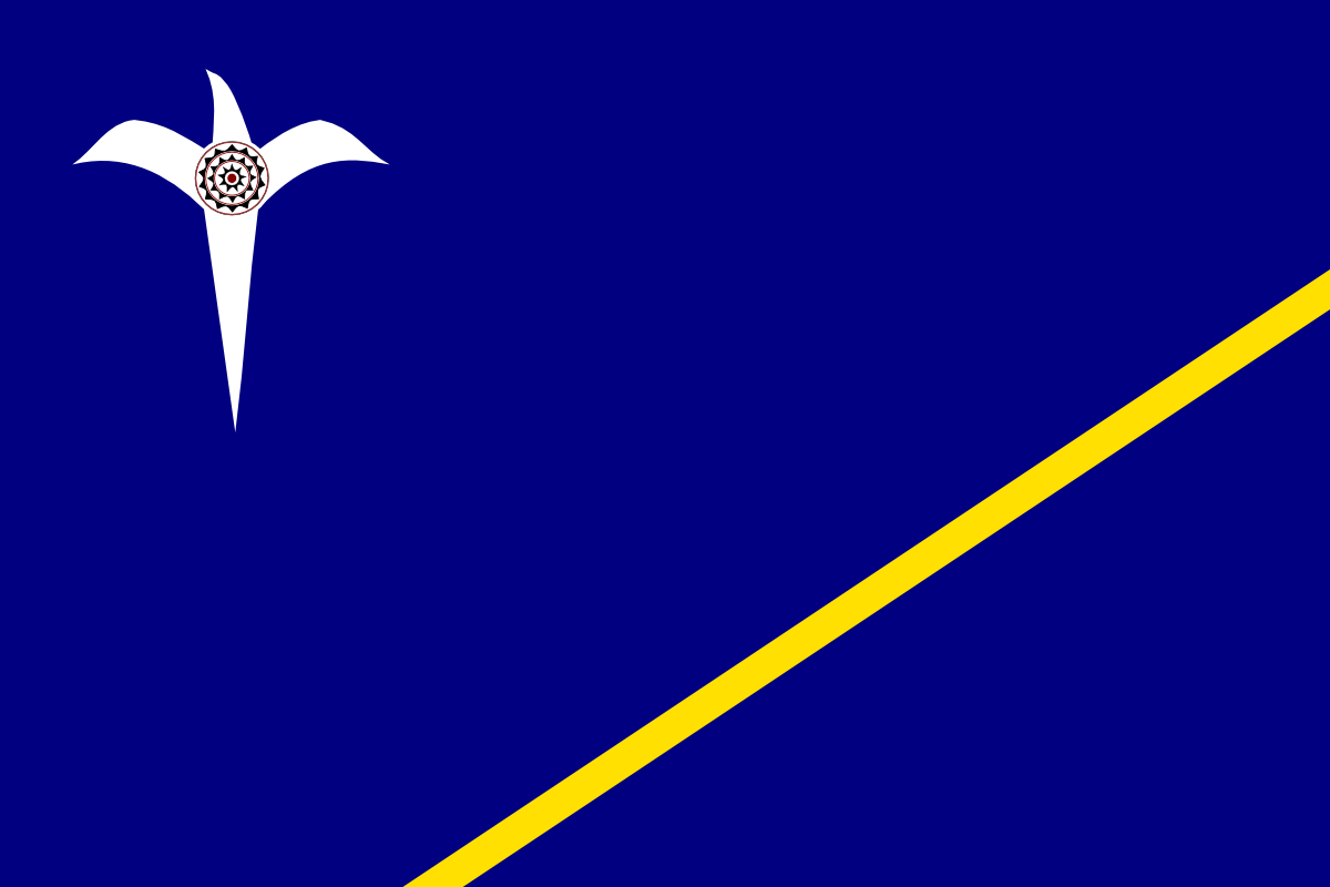
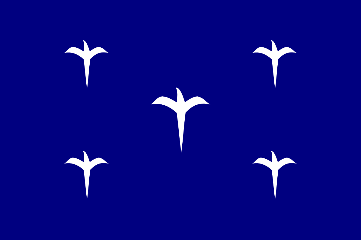
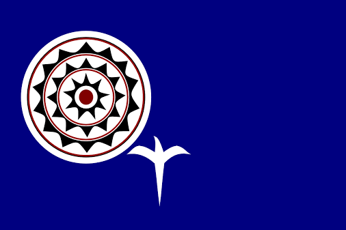
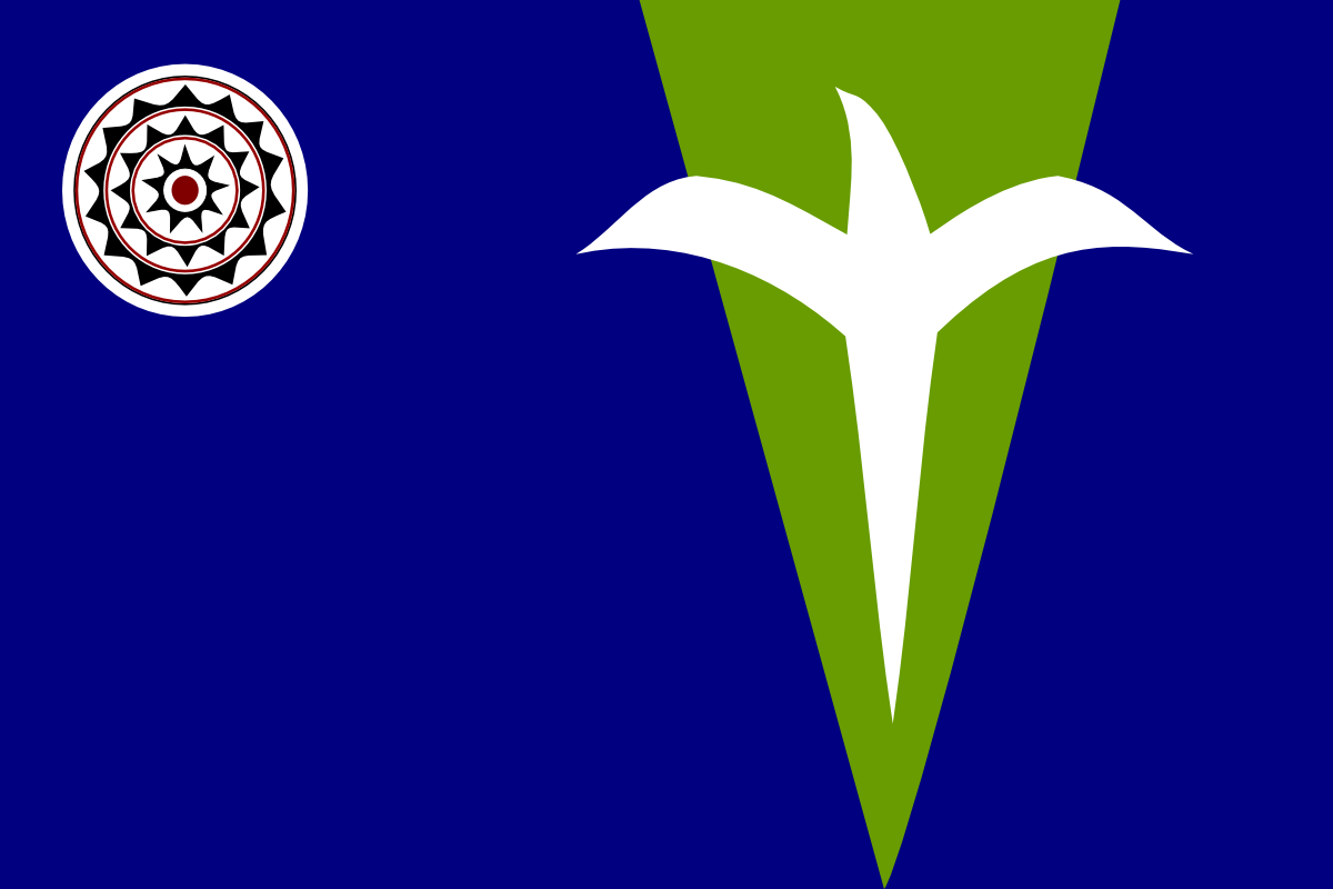
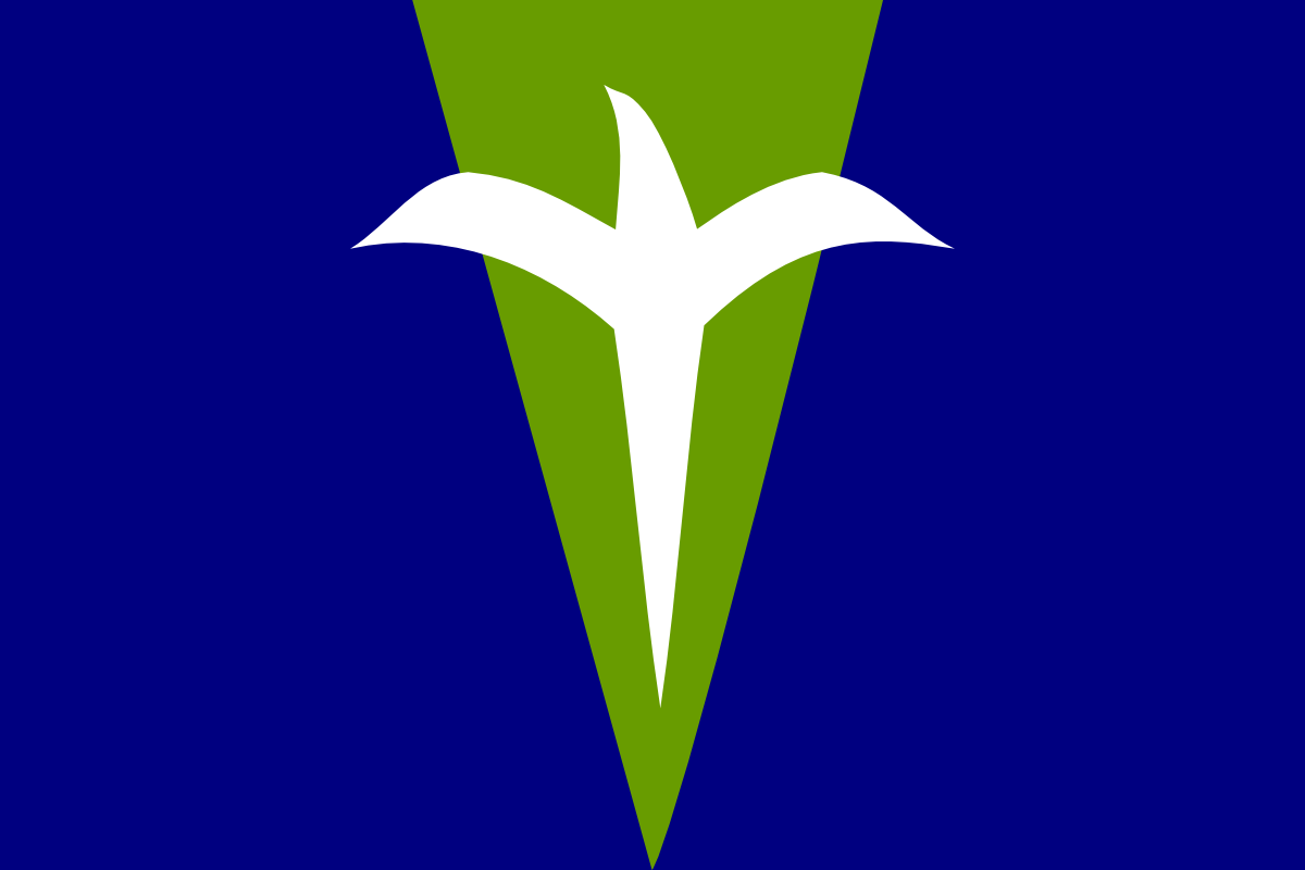
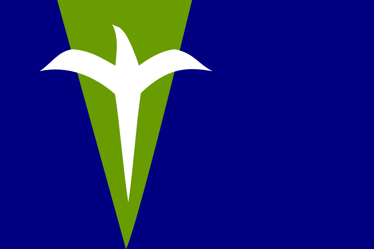
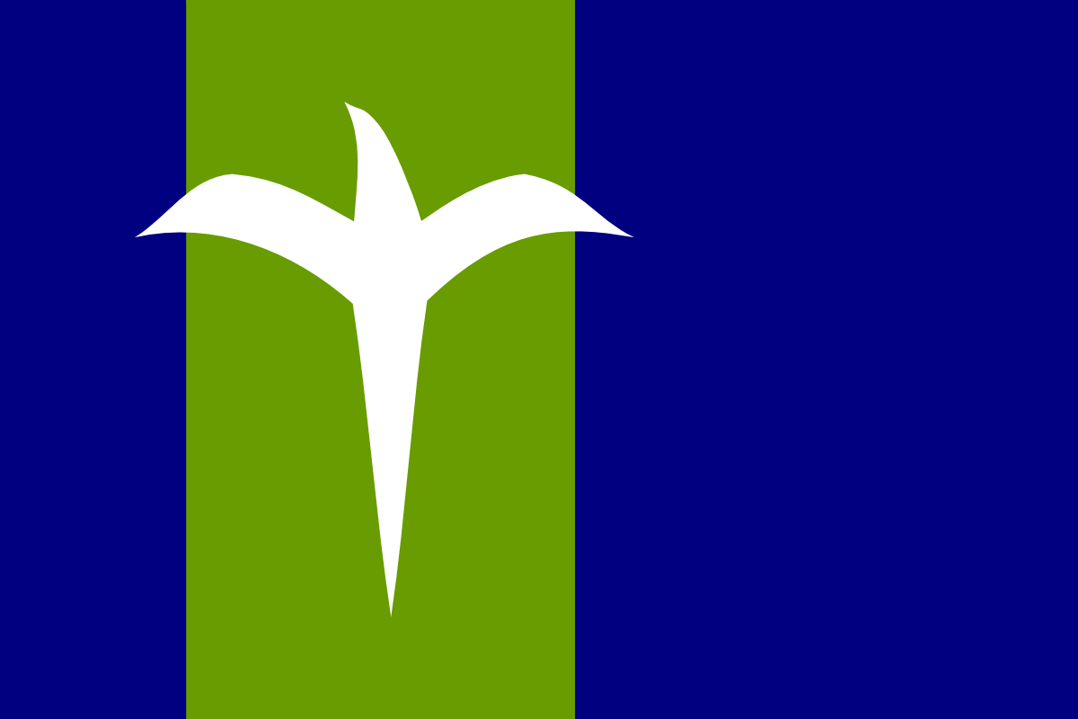
The white marking is a silhouette of Lillium formosanum (wild Lily), which has long symbolized the struggle to gain freedom in Taiwan. It is aso stylized to looke a soaring bird, for independence, solidarity, spirit of exploration. The blue and yellow theme is the theme of most pacific islands.
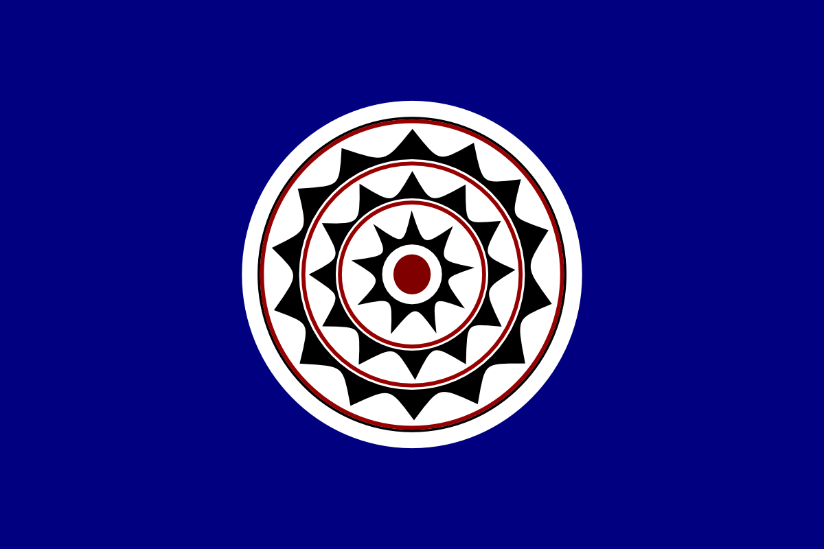
With mata symbol of the Tao people at the lily/bird’s side, also acting like the sun
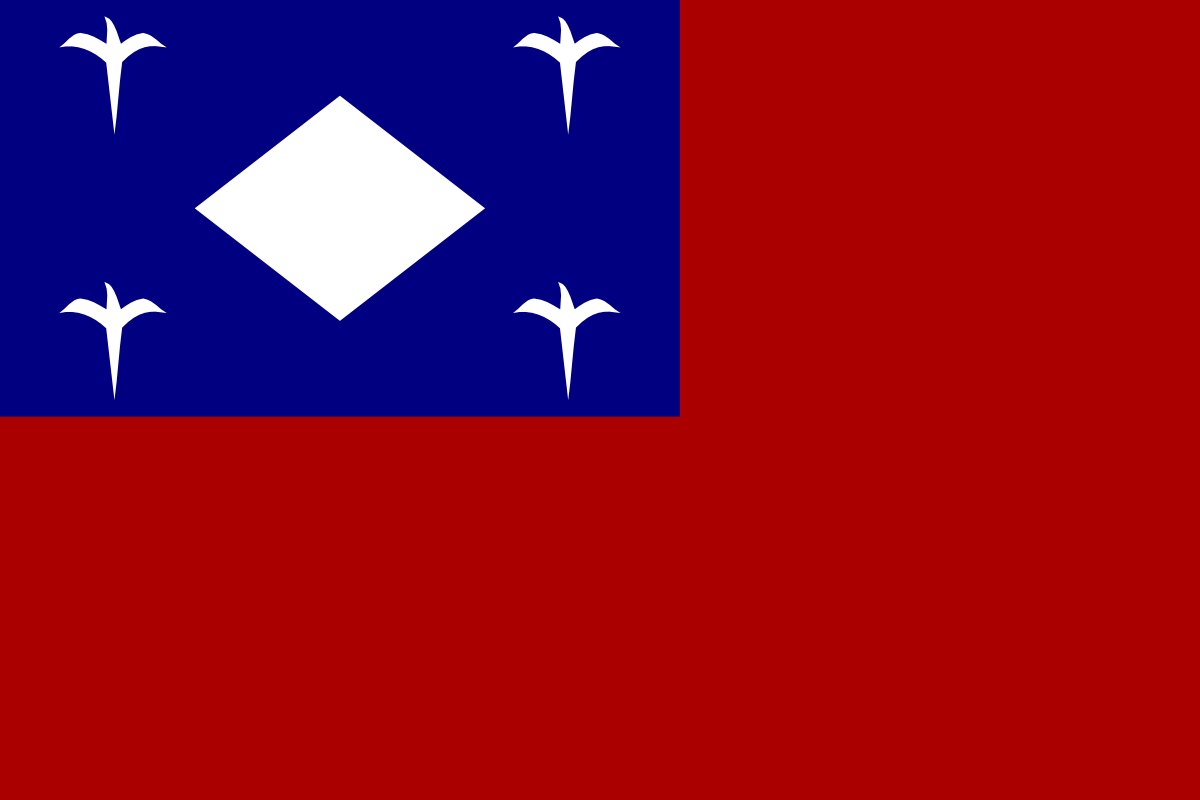
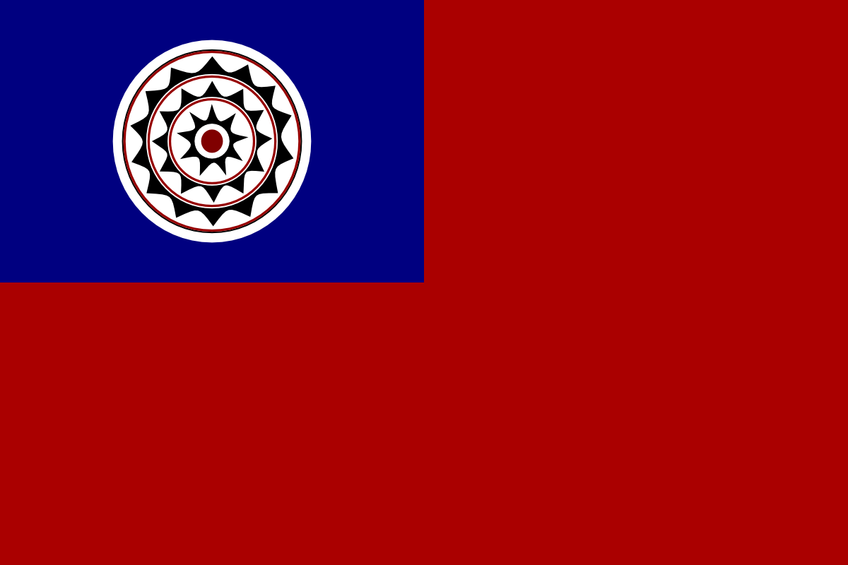
I didn’t think they were great, but I like the theme of it, not much of a graphics designer, so all I can do from this point to play around with other world flag elements. But I was told by some Taiwanese friends that it just doesn’t feel like a national flag to them without the red/blue patch format.
Why only the Tao? How about a flag that combines symbols of all the aboriginals (Of course, that’s a political problem because who is/isn’t a tribe is tricky).
I’m a fan of the Plumb Blossom. I think it would like nice on a flag. I would also like to see a green-blue flag that both factions could stand behind (yeah right).
In all seriousness, I support reverting to the Republic of Formosa flag. A little over-the-top, maybe, but very very cool.
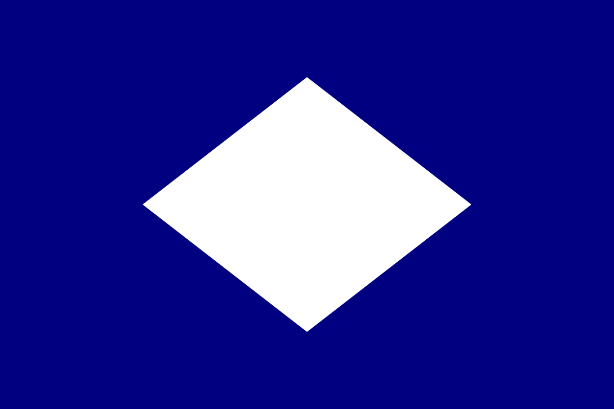
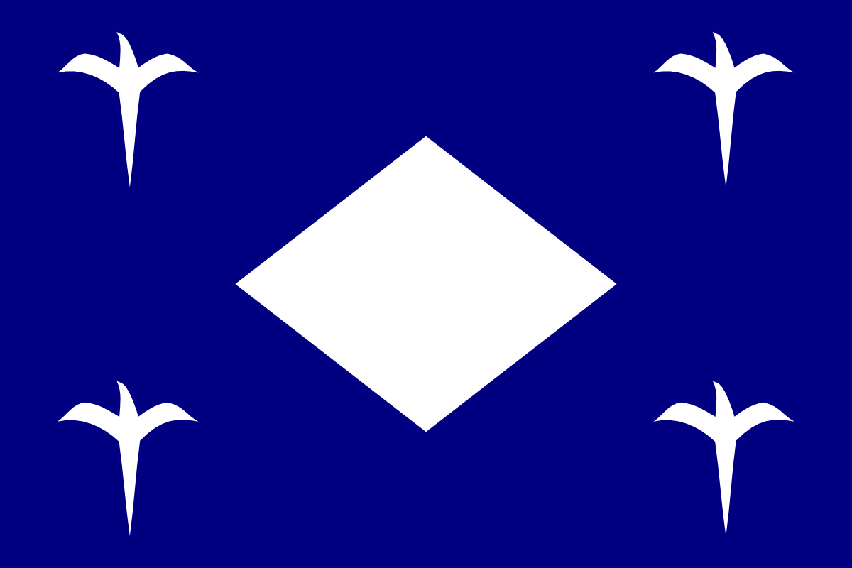
combining all elements is impossible. when you go to a aboriginal village, there will be many rhombus decorations, sometimes all in black, sometimes in black and red pairs, sometimes in white with black or other backgrounds. That near universal symbol is also mata, ancestor’s eyes. It carries the same meaning as the tao mata. I choose the tao mata because it is more artistic, and also I tried to make rhombus the focus of the flag, but I have trouble making it look good. I am sure others can. I just don’t know how to arrange it. The ones I did I know will be made fun of by regular Taiwanese, they would call it 狗皮藥膏 or something offensive to the aboriginals.
The Tiger flag is meant to show submissiveness to Qing, doesn’t actually represent anything of Taiwan. It is a cool looking flag, but it seems irrelevant with modern Taiwan. I like the color combinations though, maybe I can come up with something in that color scheme.
the underlying meaning to that flag wasn’t self-determination, it was we’ll try to weasel out of an international treaty by pretending self-determination and ask for foreign support, while using all Qing armies to drag on as long as possible.
It’s a cool part of the history, and it is a cool looking flag. It’s sad that even the flag displayed in National Taiwan Museum is only a replica… But using it would be like continue using the Grand Union Flag as the US flag. It’s not ugly and it’s the first flag of the US, and the primary flag used during the revolution, but… just out of date and relevance.
white: holyness, open information, God, love for your God, right to believe in Being superior than kings
green: restoration, sustainable ecology, life, love for your neighbors, right to be treated equally as a human being
dark brown: sacrifice, free market, earth, love for your environment, right to have fair access to clean air, water and soil
I like the meaning behind green and brown. But considering relatively few people in Taiwan follow a monotheistic religion, I’m not really a fan of what the white means.