Proposals for Taiwanese flag

instead of betel nut or the flower themselves, this is a Amis 'alofo (a betel nut bag, sewn by girls to give to the one they like).

using this as the design should probably look pretty cool, if I actually had digital design skills…

the problem is… there usually are many symbolisms in the stitch word, that almost can act as writing, at least in the old days, and I have no idea what’s what…

by the way, someone had this proposal for when Puerto Rico officially becomes the 51st state

yep, aside from the 8 chrysanthemum flag and the weird colored flags, that’s the best looking flag out there. It’s a bit similar to the DPP flag. My grip with it is of course… I don’t lie map on flags…

I’m not visually or spatially oriented, and I don’t know anything about design, but I think Taiwan’s flag should be very busy. It should be like the work of a master Egyptian tomb artist run amok. It should get viewers’ attention, and if possible, visually assault them. Some suggestions:

I think it should have a cornucopia, or an overturned bushel, or something similar in function, containing a rice sheaf, taros, sweet potatoes, sugar cane, peanuts, pumpkins, tea leaves, various fruits, etc. (No binlang!) I think it should have lots of different flowers, too, even the blossoms of the food plants. If you feature a lily prominently, it should have a speck of blood on it.

The flag should contain animal images–the black bear, the leopard cat, the clouded leopard, the barking deer, the mountain dog, purple crow butterflies, several kinds of birds in flight, etc.

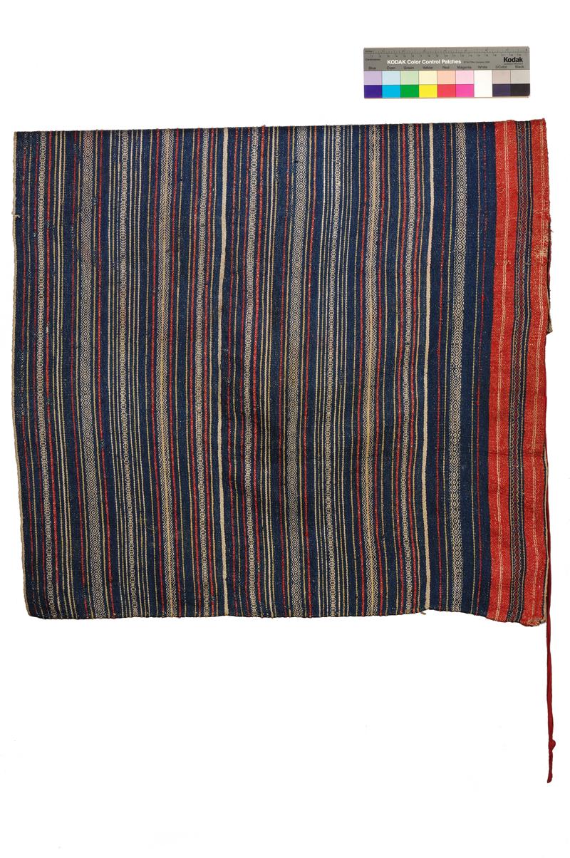
The aborigines can be represented by a prominently-located feather as well as the other symbols mentioned in this thread.

The flag should have the sun, the moon, the stars, the mountains, and the sea. Of course there should be prominent symbols of urban life and of industry. The traditional conical straw hat should be featured, to represent hard work and the value of workers.

The characters 國 and 學 should be present somewhere on the flag.

If you can’t fit all that on a flag, you should come as close as possible, and if it’s possible, you should put even more stuff on there. Even if people don’t get it, it’ll get their attention, and they’ll know that Taiwan is about a lot of things, and that there’s something about it that’s different from all the other countries.

i would die drawing half of that stuff :stuck_out_tongue:

how about this for visual assault?

2 Likes

image

Yea, all those 19 century national flags are based on antique trigonometry. The new thing is called fractal. Taiwanese flag should use it to design. This butterfly fractal is a starting point.

1 Like

I was just daydreaming out loud. I apologize for my use of the word “you.” I meant it in the general sense; I didn’t mean that you personally should design such a flag. I have to admit that my daydream would make for a difficult, maybe impossible, undertaking.

And your designs look great. They’d work just fine. The lily is a very good idea.

Yikes! That’s a visual assault all right.

just thought I update the flag design… I took a portion of the weaving pattern and draw it… it wasn’t easy, and by no means is it perfect… but i tried my best…

1 Like

As a vexillology fan, I have followed the various flag discussions with interest. (If only all the would-be flag designers would take an interest in vexillology–and necessarily, also in heraldry–then Taiwan would achieve independence for sure!) Like language reform, most flag design proposals fail to attract support from anyone other than the designer, and this is very noticeable in the parade of TI flag designs. The Tailiandang even held a contest a few years ago, whose results seem to have been immediately forgotten–much like the other flag threads here.

Ideally, a flag should be simple. Keep the number of colors and emblems to a minimum. 2 colors and 1 emblem are not too few. Bonus points if the flag can be constructed/sewn or sketched by ordinary people (or perhaps, spray-painted on abandoned warehouses while avoiding PLA searchlights).

For Taiwan independence, the best design I have yet seen–and crucially, the one with the most popular acceptance–is the Canadian WUFI one (three vertical stripes of green, white, green, with the shape of Taiwan–also in green–at the center). Of course, reliance on maps (or words) is generally frowned upon by the better class of vexillologist, but counterexamples include the national flags of Cyprus and Kosovo (which, interestingly, share with Taiwan the important feature of disputed sovereignty).

The 1895 Yellow Tiger flag is a good design (amazingly, no other country has a tiger on its flag), but sends a confused political message. It was flown by TI supporters in at least one novel. I often joke that the rebels ought to fly a Hello Kitty battle flag (in which Kitty bares her usually nonexistent teeth, and shows her claws), just to get the image on TV (or at least 4chan).

For a Taiwan SAR, obviously the knee-jerk impulse of the design committee will be to imitate the flags of HK and Macao, probably in blue (since the other primary colors are taken) and with the plum blossom featured prominently (perhaps with five stars superimposed). For a more creative approach, the designers might consider adopting a right-triangular flag (similar to temple-fair pennants, or half the flag of Nepal), to emphasize the Chinese cultural patrimony. Conceivably the PRC might even allow Taiwan to continue flying the ROC flag (offers have already been made along these lines).

(Sorry I can’t do graphics to illustrate these, but I hope you get the idea.)

On a related note, there is, believe it or not, an official Taiwan tartan.

1 Like

that as back in 2004, and the final 5 choices are:

appledaily.com.tw/appledaily … 4/1427568/

I dont remember which one was the winner. One of it looks like the sign from Fairy Tail on a Ukraine flag.

That is the concept of my original Lily/flying bird design. Added other things just to explore a more inclusive design.

yep, all the aboriginal tartan usually have embedded messages which often represents a specified house.

2 Likes

I’m afraid I can’t view the image.

Another idea that occurred to me was a modification of the Gadsen flag, with a 100-Pacer as the snake, and “Don’t Tread On Me” translated into Chinese.

At this point, I think the best tactic would be to encourage the (current) ROC flag to be flown alongside the Canadian-inspired, green and white WUFI Taiwan flag. That would send an inclusive political message, and doubly irritate the PRC!

EDIT: Strange–according to this, the flag I had in mind was not from WUFI, but from the World Taiwanese Congress:

taiwandc.org/flags.htm

(It’s the first one.)

same flag design but going with the diagonal stripe theme of the Pacific nations:

1 Like

wouldn’t that be the flag for Hong Kong?

Absolutely horrid.
:hand:
Retarded, in point of fact.

Why we need a rehash, when smell the glove’s classic thraed will more than suffice:
forumosa.com/taiwan/viewtopic.php?t=48032

fixed the link:

How about a flag with four-way symmetry, so it can be hung horizontally and vertically without coming up with weird rules*, and can’t be hung upside down?

Japan has the right idea.

*E.g. for the US flag, instead of simply rotating the flag 90 degrees clockwise, you first have to flip it and then rotate it so the stars remain in the upper left corner.

1 Like