similar ideas but not identical. the dpp is a party flag. The cross is generic and geometric. There is a well-known “sister version” which is the Republic of Taiwan flag, which was inspired by the Canadian flag. However the island shape in the centre is not symmetrical and is difficult for children to draw.(it was one of my concerns that i didn’t mention until now.) Almost all of these flags are nation-state flags which inevitably are “euro-drived” if we go down the path TGM thinks.
Reducing geometry further we’d get two strips such as the indonesian flag. It’s a balancing act. How much simplicity?
By the way TGM feel free to respond to my points about the Indonesian emblem and the Vietnamese( commies, of european origin) and the Singaporen flag and emblem. How about if we review the flag of the Phillipines. Reminds people of certain “colonial power” perhaps?
Still sounds like a very weird attitude because I don’t think anybody consulted us Taiwanese before they decided how their flags should look. In fact I’m not sure anyone other than Taiwanese ourselves care. Why would you judge some one else’s nation based on its flag? If you show me the Singaporean flag and ask me what it means, I’d say that I don’t care and I don’t presume know. I can guess, but it means something to them, not me.
Ask most Americans how their flag should look like when Puerto Rico becomes the 51st state, they wouldn’t have an opinion either. But since we are discussing about designing a future flag for Taiwan, how hard is it to imagine that people participating in this thread and certainly many advocates of Taiwanese independence would care.
Anyone with a passing knowledge world flags (and strangely have never seen the Singaporean flag) would say it’s some sort of Muslim country related to Indonesia.
Not my design, and there is an official version from its designer.
My take is four colors can represent 4 major ethnicity groups, Aboriginals, Early Han immigrants, Late Han immigrants, and New immigrants. It also looks like a representation of Taiwan the island, surrounded by beaches and ocean. I wonder if taking away the white parts would be an improvement.
(see bold)
If that’s one way of interpretation, that you think there ought to be significant mentioning of 4 divisions of ethnic groups, then in the Formosa Cross I proposed, you already have four equal quadrant, occupying equal area, without hinting at which one is which.
This might be foresight but individuals may choose different interpretations for the Formosan Cross. Maybe someone will think that christianity although being a minority is represented and respected? I’m pretty sure a lot of DPP supporters do not NOT vote for DPP because it there is a cross in the dpp flag.
From what I recall the design of the cross means cross-road, meaning that the dpp didn’t know which way Taiwan should go, and they advocated there should be a referendum.
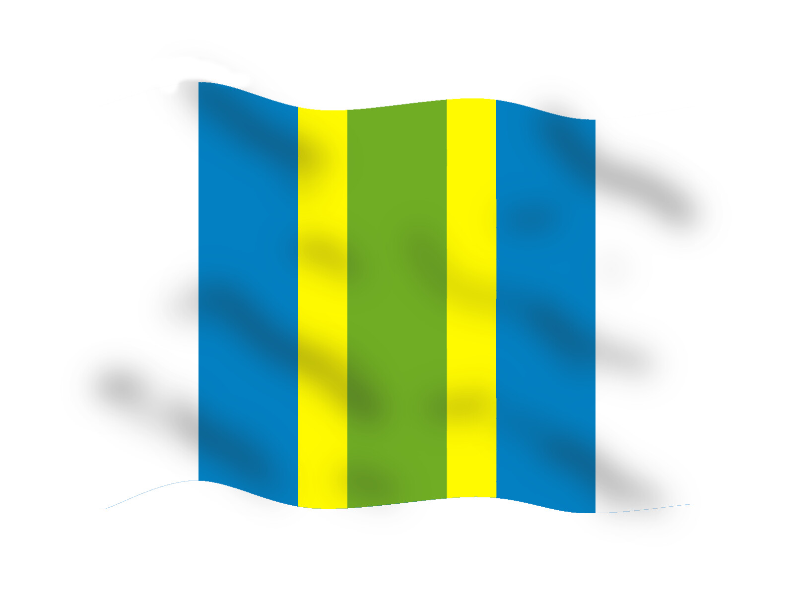
yeah, Lin Zhongda’s 5 vertical stripes design is so far my favorite of all designs as well.
as for prank flags, I think the flip flops flag can have half blue half white fields, and a white flip-flop on the blue field, and a blue flip-flop on the white field. it’s be the ying-yang of flip-flops.
Poor choice of colour. I guarantee Kent picked this color because he’s under the influence of the Tiffany green. It won’t be fashionable comes next year. Then what.
How exactly would shades of cyan be out of fashion? It’s like one of the basic colors of CMYK. Also, tiffany has been using their tiffany blue since 1845.
The current version unilaterally changed by the KMT back in 1921 in Guangdong. The usage of the flag only expanded as KMT expanded militarily. The flag is tied to the KMT as the flag uses the original KMT emblem. The current KMT emblem and the ROC emblem differs only the how it’s cropped. That was defined in 1928 also by the KMT unilaterally.
There’s no way to remove KMT symbolism out of the current ROC flag.