Just a rough idea and variations:


number three has a good shape and a good font for kids (unless it’s a copyrighted Disney font), but the background is wrong, i think. what about sky and clouds behind there?
All good stuff. Of course mine are crap. I’m not pretending otherwise. Plenty of good information there Jack.
I didn’t respond today much but I’m still keen on all contenders. So far Dragonbones is the only one in the running for my lousy two grand.
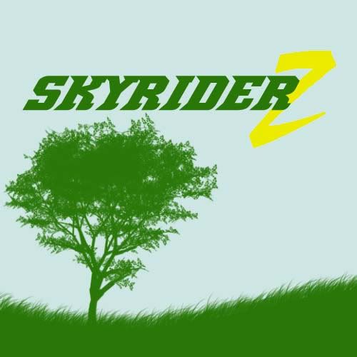
The name is skyriderz. The z will be used as an insignia for clothing, helmets, etc. It must be hip, but have an environmental bent.
Where’s the sex?
If you can put the z back into the town bike you win Dr. McCoy.
I was thinking of replacing the green circle with a color Earth, but didn’t have time at work. Maybe this weekend.
[quote=“urodacus”]number three has a good shape and a good font for kids (unless it’s a copyrighted Disney font)…[/quote]Well, surely the license of any typeface should be checked before it’s used in a commercial logo? Every typeface is someone’s IP. Granted, you don’t often hear of people being sued over this stuff but it does happen on occasion.
What about this one:

or

or

or

0r

[quote=“Fox”]What about this one:
I prefer no. 3 or no. 4. the colours work together better.
If you put a globe in there, it doesn’t mean environmental, it means world-wide. Maybe you should have trees and stuff. I would just use a z and turn it into a bike. But I can’t draw.
Taking on board the comments so far about simplicity:


[quote=“Fox”]Taking on board the comments so far about simplicity:
[/quote]
I think this one is starting to go in the right direction.
What you’ve got to remember is that there are logos, slogans and, well, the rest.
Your website and printed literature can have nice pictures of kids on bikes and mountains and rivers and beautiful blue skies. They don’t need to be in the logo. Jack Burton’s advice is spot on and I agree wholeheartedly with what he said.
A logo just needs to be the name of the company written in a nice way, and can (if you wish) subtly reflect the purpose of the company.
You want to reflect “environment”, so go with a blue or green logo (it hard to use both of these colours in a complementary manner, in my experience). Don’t mix loads of colours. Black or white with one, or POSSIBLY two, other colours max.
Thanks Stu. My mum used to say, “Blue and Green” should never be seen.
I agree Jack Burton’s advice was perfect and HG’s comment on the original colors insulting to hot pink and gold lovers like yourself.
Thought I might develop a new logo for my school while I was at it:

I didn’t think you looked like that from behind, Mr Fox.
And it appears you got a bit sunburnt, too.
[quote]I didn’t think you looked like that from behind, Mr Fox.
And it appears you got a bit sunburnt, too.[/quote]
I designed one especially for you.

[quote=“Fox”]Thought I might develop a new logo for my school while I was at it:
[/quote]
I’d tap that class.
mabeh? Gosh… too much free time at hand.
p.s. PSD file available upon request
edit: never mind found out, whoops! for kid it is!
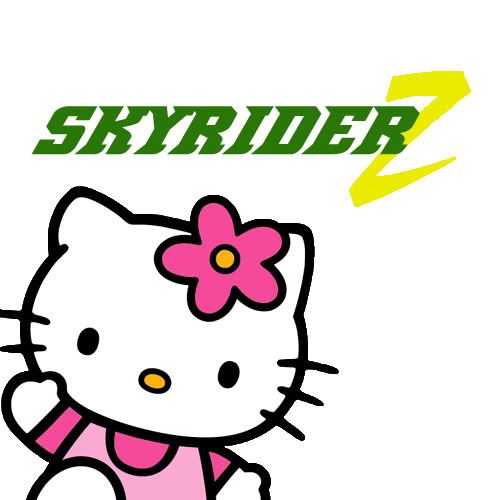
ah… there. kiddy version to satisfy all the Hello Kitty craving. Now if only there’s no copyright issue…
I like the tree and the green.
What font did you use to write skyrider?
It’s definitely in the ball park.
The font’s called Demonized. You can find it here dafont.com/demonized.font
where’s my two thousand taiwanese dollah!? :raspberry: