Out of the mouths of babes…
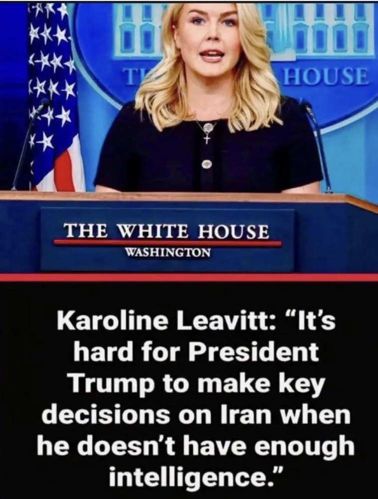






Ever occur to you that we might have way more wars then?









We may have to change the thread title to Stupid Political Pictures. 
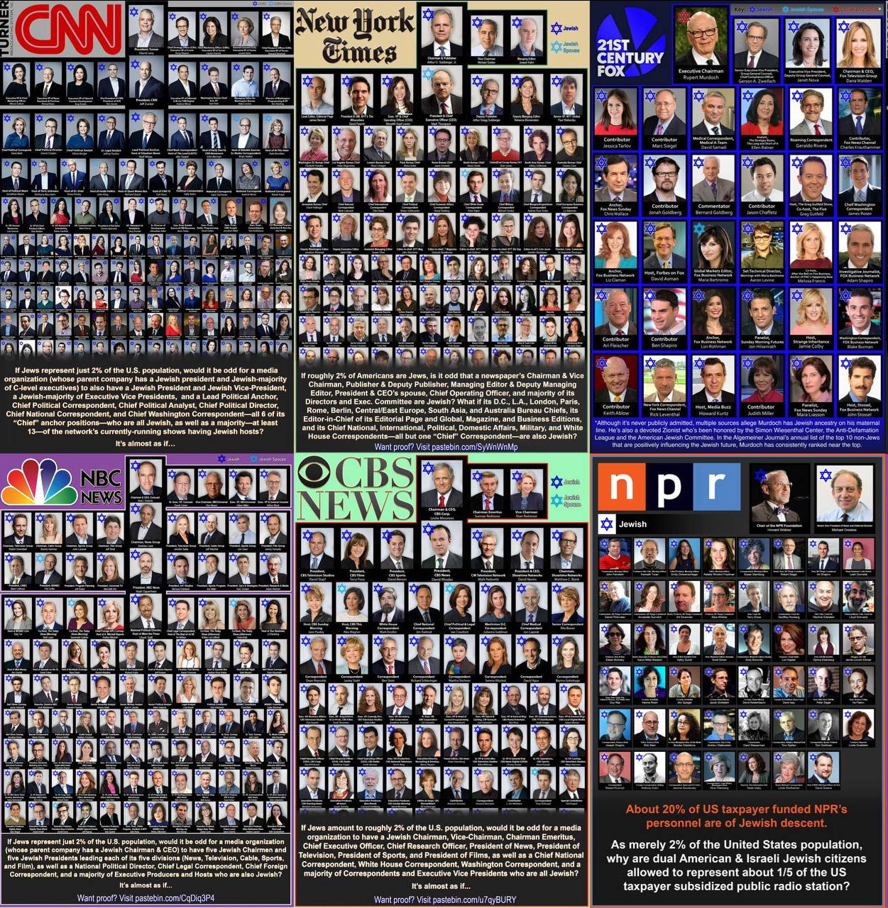
But here, I’ll let AI explain all the ways this image is nonsensical, mostly because it uses standard gimmicks that should be understood so as to better recognize propanda in general, (China and Russia are the same):
Short answer: the image is propaganda, and its central implication is false. It's worth walking through why, because the technique it uses is more interesting than the claims themselves.
The lists are unreliable on their own terms. Notice how many entries are marked “Jewish spouse” rather than Jewish — if the thesis held up, padding with in-laws wouldn’t be necessary. The Fox panel openly concedes its central claim about Murdoch has “never been publicly admitted” and rests on allegations. Compilations like this are typically assembled by guessing from surnames, and they routinely misidentify people, assert private religious affiliation that was never disclosed, and use outdated titles. They also mix tiers freely: network chairmen sit alongside freelance contributors and beat correspondents, because filling a grid of 80 faces requires scraping deep.
The underlying demographic fact is real, and unremarkable. American Jews are roughly 2% of the population and are overrepresented in journalism, as they are in law, medicine, and academia. The mundane explanations do most of the work: heavy concentration in New York and Los Angeles (which happen to be the media capitals), unusually high rates of university education, and historical patterns where an excluded minority clustered into industries that were new and open — early Hollywood being the textbook case. Overrepresentation of some group in some field is the norm, not the exception. Nigerian-Americans in medicine, Korean-Americans in dry cleaning, Punjabi-Americans in long-haul trucking. Disproportion is evidence of history and geography, not conspiracy.
The internal contradiction is fatal. The image puts Fox News and NPR in the same collage. It lists Ben Shapiro and NPR’s newsroom as data points for one thesis. These outlets spent the last decade attacking each other daily on nearly every contested question in American life. If this were a coordinated bloc, it would be the least effective one in history. The argument requires you to believe that shared ancestry produces shared agenda, then presents as evidence a group of people with violently opposed agendas.
Ownership doesn’t work the way it implies. These are publicly traded corporations — Comcast, Paramount, Warner Bros. Discovery, Fox Corp — whose largest shareholders are index funds. Editorial output is shaped by advertisers, subscriptions, and audience incentives far more than by any executive’s background. And empirically, the same outlets pictured here are constantly accused of anti-Israel bias by media-monitoring groups. Both accusations can’t be right.
The dual-citizenship line is invented. The NPR panel slides from “of Jewish descent” to “dual American & Israeli citizens” with no evidence. Being Jewish confers no Israeli citizenship. That’s not an error; it’s the point of the graphic — the whole thing is built to move the reader from a demographic observation to an allegation of foreign loyalty.
This format has a traceable lineage, running back through neo-Nazi publications of the 1970s–80s and, before that, to Nazi-era German press and the Protocols of the Elders of Zion forgery. The “It’s almost as if…” ellipsis is doing deliberate work: it invites you to complete the sentence yourself so nothing falsifiable ever gets stated.
So fewer Jews do more of the heavy lifting? 