[quote=“bubbles”]I find there isn’t a lot of contrast between the colors for “new messages” and “no new messages”, and have to squint to see the difference.
Or maybe I just need more sleep.[/quote]
No, it’s not you. The icons really are much too similar, and it’s not just a color issue – the icons should be more distinguished graphically as well, IMO. For example, ‘new messages’ could be an image of MJ blowing Bubbles in the bath.
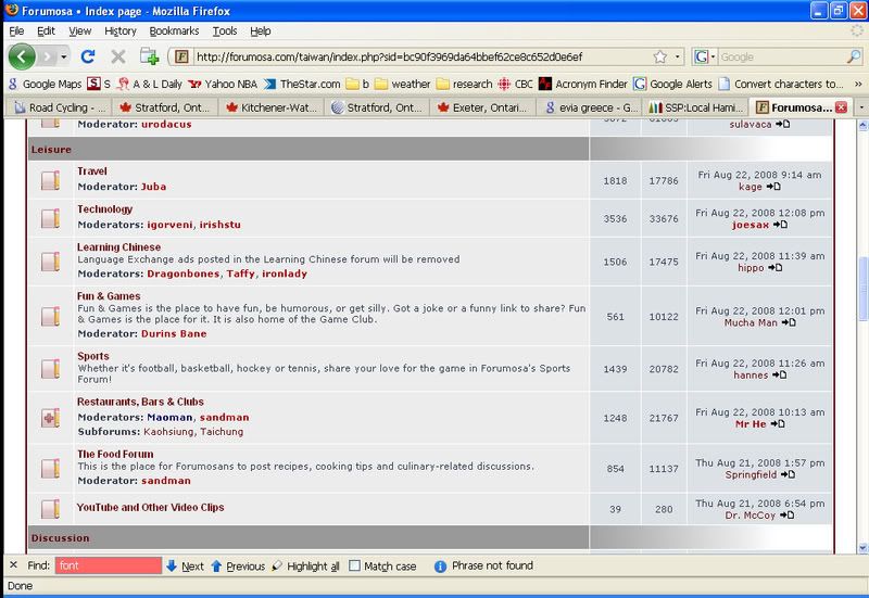
Does anyone else dislike the new font for the forum titles and thread titles? It lacks sharpness, or something. Perusing the list of titles on the board is somewhat troublesome from a visual perspective.
I don’t think I’m explaining myself very clearly, but there’s something going on, anyway. Maybe there should be a user option in the control panel for formatting the font?
[quote=“rousseau”]Does anyone else dislike the new font for the forum titles and thread titles? It lacks sharpness, or something. Perusing the list of titles on the board is somewhat troublesome from a visual perspective.
I don’t think I’m explaining myself very clearly, but there’s something going on, anyway. Maybe there should be a user option in the control panel for formatting the font?[/quote]
yeah i agree, i don’t like the look of the fonts too much compared to the old site. it all looks a bit bland and square…other than that everything looks good.
[quote=“rousseau”]Does anyone else dislike the new font for the forum titles and thread titles? It lacks sharpness, or something. Perusing the list of titles on the board is somewhat troublesome from a visual perspective.
I don’t think I’m explaining myself very clearly, but there’s something going on, anyway. Maybe there should be a user option in the control panel for formatting the font?[/quote]
Thanks for the feedback
Do you know how to post a screenshot of what you see? As far as I can tell, the fonts used here are standard sans-serif typefaces (Arial, Helvetica). And this is indeed what I see when I view the forums - in Firefox, IE and Safari on Linux and Windows systems. And what I see is sharp and clear
But you are not the only person to complain about the readability of the forums. We haven’t figured this one out yet, but we haven’t given up.
Which brings us back to your screenshot. If you don’t mind, also please identify the browser you are using, the operating system and your screen resolution.
BTW, as reported earlier, if you are using Windows, try switching on (or off) your Cleartype settings and let us know what (if anything) happens
[quote=“Truant”]You might want to also check the characteristics of outgoing hyperlinks embedded in messages.
The old way was to open a new window, but a couple I tried earlier keep the same window, but browse away from the site.
Parent, target, self and all that…I can’t remember which is which.[/quote]
I personally prefer target=_self (or target=_parent), which does not open a new window or tab. I feel this way because opening in a new window or tab becomes a choice for me, and I like having options
I guess you prefer the old way, or are you open to this change?
[quote=“Goose Egg”]I personally prefer target=_self (or target=_parent), which does not open a new window or tab. I feel this way because opening in a new window or tab becomes a choice for me, and I like having options
I guess you prefer the old way, or are you open to this change?[/quote]
In Opera if you middle click on links they open in a new tab. By the way, the site seems to work fine on Opera 9.51 in both Windows 2000 and Vista.
I’m using Firefox Mozilla on Windows XP. Screen resolution is 1024 by 768.
Here’s a screenshot. I used the maximum setting for “Save for Web” in Photoshop so that the file wouldn’t be crazy large, so any blurriness would be due to that. I’m not talking about blurriness anyway, just a lack of sharpness with the font.
[quote=“Goose Egg”][quote=“Truant”]You might want to also check the characteristics of outgoing hyperlinks embedded in messages.
The old way was to open a new window, but a couple I tried earlier keep the same window, but browse away from the site.
Parent, target, self and all that…I can’t remember which is which.[/quote]
I personally prefer target=_self (or target=_parent), which does not open a new window or tab. I feel this way because opening in a new window or tab becomes a choice for me, and I like having options
I guess you prefer the old way, or are you open to this change?[/quote]
I don’t really mind either way, and you are right I can hold shift and open a new window if I wanted.
I was just mentioning in case the shift in characteristics was intended.
[quote=“rousseau”]I’m using Firefox Mozilla on Windows XP. Screen resolution is 1024 by 768.
Here’s a screenshot. I used the maximum setting for “Save for Web” in Photoshop so that the file wouldn’t be crazy large, so any blurriness would be due to that. I’m not talking about blurriness anyway, just a lack of sharpness with the font.[/quote]Have you tried all three settings for font smoothing - off, standard, and ClearType?
Maybe it’s something to do with the colours? Have you tried changing the board style? (User Control Panel > Board preferences > My board style).
With ClearType smoothing on, the fonts look fine to me on a variety of display settings including 1024x768. The contrast between foreground and background colour could be better I guess, although I believe they’re the same colours they’ve always been.
[quote=“joesax”][quote=“rousseau”]I’m using Firefox Mozilla on Windows XP. Screen resolution is 1024 by 768.
Here’s a screenshot. I used the maximum setting for “Save for Web” in Photoshop so that the file wouldn’t be crazy large, so any blurriness would be due to that. I’m not talking about blurriness anyway, just a lack of sharpness with the font.[/quote]Have you tried all three settings for font smoothing - off, standard, and ClearType?
Maybe it’s something to do with the colours? Have you tried changing the board style? (User Control Panel > Board preferences > My board style).
With ClearType smoothing on, the fonts look fine to me on a variety of display settings including 1024x768. The contrast between foreground and background colour could be better I guess, although I believe they’re the same colours they’ve always been.[/quote]
Actually, I’ve gone back to using Safari (just for Forumosa). With smoothing, the fonts look blurry in Firefox. Without it, they look far too jaggedy. As I said, in the older version I didn’t have to use smoothing at all. What’s changed? I think it’s only the topic titles (when looking at the list of latest threads, for example) that are really bad. Could be because of size, style, font, or colour. I reckon it has a lot to do with the fact they are bolded (and possibly that coupled with the size).
See in your picture, “Dragonbones” is really easy to read, but “Dragonbabe” is not. So what’s the difference do you think? It actually looks like the kerning, now that you can compare those too. Or the “Dragonbabe” font is narrower for some reason.
Here it is on FF3, zoomed in two notches (that’s what I’m keeping it on as that seems to work best for most sites for me). Looks OK to me though the bold text is a little overpowering.
Looking at the HTML Dragonbabe is class=“topictitle” and Dragonbones is class=“username-coloured”. I think there is some difference between topictitle and username-coloured that causes one to be ClearTyped and the other not to be.
Problem is I can view the stylesheet, I found this in the html
Dunno why, maybe it’s because it’s dynamically generated or because I fucked up making the relative path absolute. Anyhow one of these styles ends up ClearTyped and one doesn’t.
It’s quite a subtle process - it depends on the font size (bigger fonts are more likley to be ClearTyped because it makes small ones look blurry), weight (I think bold makes it more likely). Obviously the browser engine can affect things too, it seems like it looks good in IE but bad in FireFox or Opera.
Now I say bad here, but it honestly didn’t bother me until you pointed it out. I’m using Windows 2000 because I’ve got an ancient machine here, Vista seems to be better at ClearType.
I like the new version overall (and thanks for bringing the website back so soon), but is it really necessary to refresh the banner at the bottom every 30 seconds? Isn’t this going to cause crazy traffic costs? Let’s say I open 25 tabs, then go on vacation for a week while leaving the computer running, wouldn’t that be 2KB*25[tabs]*7[days]*24[hours]*60[minutes]*2[ads per minute]= about 1GB of traffic (depending on how your webhost counts)? For two alternating ads?
To ignore someone, add them to your Foes list in the UCP (User Control Panel)
Necessary? No. And please don’t go ahead and open 25 tabs and leave for a week
Frankly, I hadn’t given it much thought. I just noticed that it was an option in the new version of OpenX that our tech guys* have installed, and figured I’d try it out. If it turns out to NOT be a good idea, then it won’t be difficult to change. I’m ready to be convinced one way or the other
*there is a lot that is being upgraded at Forumosa right now, and I’m looking forward to sharing with everyone the cool guys who have been helping us make it happen. More on this later this month