The new format has been going around saying you punch like a girl
[quote=“Dragonbones”][quote=“joesax”]I’d like the 24 link back too, though.[/quote]And can we have bigger avatars please?  [/quote]Well, you can have one as wide as mine. Would you want one any bigger? I wouldn’t. It takes too much page space. Remember that some people are probably still on 800*600 displays.
Actually, the “View new posts” link is working much better for me than it used to on the old site. I just got logged out, but when I logged back in, the same list of new posts was shown. Not bad.
Oh, I like the old system in which the 150 height restriction was not enforced, while the 150 w was; mostly, you don’t want them to take up excessive width. The height isn’t such a big deal.
So I was using a 150 wide but even taller avatar; the new system now shrinks the pic if either dimension is exceeded.
I vote for making the restriction 200 high, 150 wide. ![]()
I don’t know if you’ve noticed, but the text rendering in Firefox on WIndows is terrible now (wasn’t before). Bad enough that it was doing my eyes in. Looks great on Safari though.
P.S. I checked IE and it looks bad there too.
What’s the deal with the orange smear across the document image on the far left?
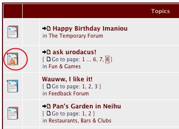
For that matter, why have the document image, or the blank spot next to it at all?
What’s the function?
Oh, this is interesting:
[quote=“Post Review”]At least one new post has been made to this topic. You may wish to review your post in light of this.
[/quote]
DB: a distinct rectanguloid bias there. i approve!
jaboney: yeah, a list of ‘what does this icon mean?’ would be handy.
Is this it? Damn, I thought it was a safe mode kindof backup…
will take time getting used to!
[quote=“joesax”]I’d like the 24 link back too, though. It’s useful for a number of reasons, such as when you don’t want to log in, or when you log out (or get logged out) and then log back in again and still want to see recent posts.
It does look nice and clean. And it’s a lot quicker.
Also, I’ve just noticed that long links are automatically truncated:
viewtopic.php?p=888959#p888959
That’s neat.[/quote]Actually, scratch my request for a “24” link completely. The “View active topics” link works really well for that purpose. It appears to be a query for the last seven days’ active topics, which is even better.
Irishstu, I also found the text a bit hard to read though I thought it was due to a change in the background colour. Anyway, I’ve bumped the zoom in Firefox up one notch and it looks much better.
There’s also a ‘Save’ button in the “Post a reply” window.
Is it functional? (type-type-type… yep, it is!)
Cool.
For how long will drafts be saved?
Will large images (for instance in the Daily Photo thread) still jump around? Please, no…
I’m doing Firefox in Windows. Text looks fine to me.
Really? Here’s the difference on my computer (Firefox on the left obviously).

Both those examples look fine to me. The one on the right is kind of soft focus, though. I prefer the one on the left.
Really? Here’s the difference on my computer (Firefox on the left obviously)…[/quote]Do you have that ClearType font smoothing option on in Windows? I do, and I think that maybe the new board software doesn’t work well with that. It just shows the basic fonts with pixels on or off - no grayscale smoothing
We are re-launching Taiwanted.com this month on a new platform. When the feeds are set up there, we’ll add them back here asap
Big ditto.[/quote]
I like the 24 link, too, but I’ve posted in the past that this no longer seems to be available for Olympus. I find it odd that a hack has not yet appeared to replace it ![]()
That would be my guess ![]()
The previous Birthday list was a rolling 30 day advanced listing. This new version had its own built in birthday database entries (fields), and they seem to be empty. Ya think we should make this a required profile entry (field)?
Let’s talk about this. I think most of us will want to make sure that the widths are not too wide
[quote=“irishstu”]I don’t know if you’ve noticed, but the text rendering in Firefox on WIndows is terrible now (wasn’t before). Bad enough that it was doing my eyes in. Looks great on Safari though.
P.S. I checked IE and it looks bad there too.[/quote]
Not for me - I’m running FF on Linux and the forums look fantastic. Look great on my iPod Touch and FF on WinXP, too.
Screenshots?
Please point me to any fixes you might find and I’ll implement them asap. I can also contact the graphic designer who made the styles for us and ask for their advice
[quote=“Jaboney”]What’s the deal with the orange smear across the document image on the far left?
For that matter, why have the document image, or the blank spot next to it at all?
What’s the function?[/quote]
I think the “function” is aesthetic - and the smear indicates a “hot” topic (defined as a thread that has more than X number of posts)
I’m not sold on the document style - can you propose another icon and help us have a new set made? Maybe little round suns with triangles for rays? Or small yams and radishes??
[quote=“Jaboney”]There’s also a ‘Save’ button in the “Post a reply” window.
Is it functional? (type-type-type… yep, it is!)
Cool.
For how long will drafts be saved?[/quote]
Drafts will probably last as long as you don’t use them or remove them
For the time being, no. But many forumosans have told me that it was useful. If someone sends me a link to a hack that does it, we’ll consider it
[quote=“irishstu”]Really? Here’s the difference on my computer (Firefox on the left obviously).
[/quote]
The left one looks choppy and low-res on my monitor, very ugly! The right one is smooth, but slightly blurry, which causes eye strain. Both are bad, but the right one looks better. I’m on IE at the moment.
Big ditto.[/quote]
I like the 24 link, too, but I’ve posted in the past that this no longer seems to be available for Olympus. I find it odd that a hack has not yet appeared to replace it ![]() [/quote]As I said above, I retract my request for a “24” link! I don’t know whether Dragonbones will also retract his once he tries the somewhat superior “View active topics” link at the top left.
[/quote]As I said above, I retract my request for a “24” link! I don’t know whether Dragonbones will also retract his once he tries the somewhat superior “View active topics” link at the top left.
[quote=“Goose Egg”][quote=“irishstu”]I don’t know if you’ve noticed, but the text rendering in Firefox on WIndows is terrible now (wasn’t before). Bad enough that it was doing my eyes in. Looks great on Safari though.
P.S. I checked IE and it looks bad there too.[/quote]
Not for me - I’m running FF on Linux and the forums look fantastic. Look great on my iPod Touch and FF on WinXP, too.
Screenshots?
Please point me to any fixes you might find and I’ll implement them asap. I can also contact the graphic designer who made the styles for us and ask for their advice[/quote]As I said above ![]() , my guess is that the new software doesn’t support the Windows ClearType function, for some reason. I’ll try turning ClearType on and off and see whether there’s any difference.
, my guess is that the new software doesn’t support the Windows ClearType function, for some reason. I’ll try turning ClearType on and off and see whether there’s any difference.
[quote=“joesax”][quote=“joesax”]I’d like the 24 link back too, though. It’s useful for a number of reasons, such as when you don’t want to log in, or when you log out (or get logged out) and then log back in again and still want to see recent posts.
[/quote][/quote]
Sorry, I kind of meant that in my original post, like the new link replaces the old 24 one.
ETA: Me three on the rectangle-friendly avvie restrictions (obviously)
Really? Here’s the difference on my computer (Firefox on the left obviously)…[/quote]Do you have that ClearType font smoothing option on in Windows? I do, and I think that maybe the new board software doesn’t work well with that. It just shows the basic fonts with pixels on or off - no grayscale smoothing[/quote]
Interesting. I didn’t have font smoothing turned on at all. I just changed that and both “ClearType” and “Standard” look fine.
For those that don’t know where the option is, it’s in Control Panel > Display > Appearance > Effects > Use the following method to smooth edges of screen fonts.
Thanks joesax.
It is much faster now. Thanks.
I don’t have the font problem but I noticed if you go to - user control panel/board preferences/board style and change from Forumosa to prosilver, the prosilver is clearer to read. Plus with prosilver all the avatar and user data is on the right rather than on the left like the Forumosa style sheet. Some will probably like that layout better.
[quote=“Goose Egg”][quote=“Jaboney”]What’s the deal with the orange smear across the document image on the far left?
For that matter, why have the document image, or the blank spot next to it at all?
What’s the function?[/quote]
I think the “function” is aesthetic - and the smear indicates a “hot” topic (defined as a thread that has more than X number of posts)
I’m not sold on the document style - can you propose another icon and help us have a new set made? Maybe little round suns with triangles for rays? Or small yams and radishes??[/quote]
Ah, I see. Smear = flame.
How about the second column?
If we were dealing with a variety of file types in threads dedicated to a single type – text, photos, audio, video, maps, torrents, programs, ect – that would make sense. As things currently stand, I don’t see the need. Do have have plans that would make such necessary?
What’s the range of indicators needed for an icon set? Document, New Document, Hot Document, Locked Thread… ???