Can I send my own version of a wet dream of the new Taiwan SAR flag:
for those who don’t know, I put the dragon from the Chinese Imperial Flag, The Chrysantemum for Japan, The Stars for the PRC (hey, it is going to be a SAR), the red from the Dutch Flag (it is a very special orange) and the Portuguese Shield completes the full set.
mr_boogie, nice design. If a Taiwan SAR if what you’re after, you can always just reuse the old Republic of Taiwan flag. The 1895 ROT was established as a country that is separate but loyal to the Qing empire. It only lasted a few months.
The Republic of Formosa flag is not as representative and only establish links with the Qing empire…
The republic was proclaimed by a group of pro-Qing high officials and members of the local gentry, many of whom fled the island upon Japan’s invasion. On May 24, 1895 an English translation of its declaration of independence was sent to all the embassies on the island, followed by a ceremony the next day. It managed to issue stamps under the auspices of the republic.
In spite of the similarity in name, modern-day proponents of a “Republic of Taiwan” tend to disavow a connection between the two, thus neither claiming a revival of that entity nor regarding themselves as political offspring of that movement. The reason for this is that the first Republic of Taiwan was created as an act of loyalty to a government on mainland China while modern supporters of the Republic of Taiwan tend to wish to distance themselves from mainland China.
[quote=“mr_boogie”]The Republic of Formosa flag is not as representative and only establish links with the Qing empire…
[/quote]
But isn’t that the point? It’s an SAR flag after all, not an independent Taiwanese republic flag. I don’t see the Union Jack anywhere on Hong Kong’s SAR flag. Perhaps a local emblem that is representative of Taiwan would be a better SAR flag – like the profile of two legislators trying to strangle each other. :bicker:
Here are some ideas for a Taiwan SAR flag. Unfortunately I don’t know how to make computer graphic images of them.
Take the current ROC flag, get rid of the white sun. Replace it with a white “plum blossom” (that five-petal round flower you see on so many emblems here.). Now put little red stars in petal, for a total of five. (Following the example of the Hong Kong flag.)
Alternative version: Same thing, but without the red part of the field. In other words: blue field with white plum-blossom, red stars in the plum blossom.
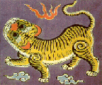
Another idea: Following the example of the Yellow Tiger flag, a blue field with TWO yellow tigers–a mother and her cub–drawn in a traditional style. (The cub should be below the mother, looking up; the mother looks down from below.) Add wispy clouds.
Wooo! Good design idea! As far as flags go, KISS is usually a pretty good principle to follow. The blue background is also a great complement to the green SAR flag of Macau and the red SAR flag of Hong Kong. The stars can remain gold (per PRC flag as well as Macau flag) or they can be identical to the background colour (per Hong Kong flag) and be blue.
Now who wants to try a hand at a new Rep. of Taiwan flag? I’m sure it won’t take a lot of effort to make it look better than the uber-ugly 908 flag. Even a plain green flag is better looking, although that design has already been taken (Libya). With the large Buddhist population in Taiwan, I was going to suggest a white lotus flower on a green background, but Macau has got that one already as well. How about a new golden sun design on a green background? It’s different enough to be unique to Taiwan but is still in keeping with the “sun” theme that has existed from the Japanese flag to the current ROC flag. Simple, n’est pas?
Not bad, but I still like Screaming Jesus’s idea of just a simple blue background. May I suggest stuffing the five stars into the plum blossom and making the stars smaller, much like what Hong Kong has done.
Another idea is to have a green background with a cup of 珍珠奶茶 in the middle. This can both be an independent republic flag or an SAR flag by putting five star shaped 珍珠 at the bottom.
I’d have liked to put in the traditional lines radiating from the center of the plum blossom, but my PS skills are lacking, and I couldn’t find a good model online.
Here’s one with the stars inside. Looks kind of circus-y to me.
A whole lot of people, apparently. Did I mention the Tai Lien Dang (Taiwan Solidarity Union) contest a couple of years ago? They must have had 50 - 100 entries.
My own entry (how could I resist?) was not very creative: the Yellow Tiger flag, but shrunk and placed in the position of honor (top corner) on a field of red. In other words, same as the current ROC flag, but replacing the white sun with the yellow tiger.
In general, if a flag incorporates elements of another flag (and it is not by accident), then it should be because the people who fly it wish to honor some sort of historical or political relationship. So a Taiwan SAR flag ought to allude to China as well as the other SAR flags, while a Taiwan independence flag probably needs to remind viewers of Taiwan’s history independent of China.
I also did a Taiwan Independence battle flag as well: Hello Kitty, snarling and raising her paw threateningly. Would that be brilliant marketing or what?
Poagao, those flags look great! I agree that your current drawing of the stars inside the plum blossom looks very circus-like. However, if we look to Hong Kong as an example again, the stars in the flower (紫荊花) are quite small when compared to the flower. I think reducing the size of the stars in your design so they are less prominent would remove a lot of that circus-like feel.
In the Macau version, the stars are much more prominent and they are yellow as well. They are outside the flower on a green background, however, which provides good contrast. I suspect that the stars are not yellow in the Hong Kong flag was due to two factors: 1) the stars are red, good enough for the communist; 2) yellow on white is not a good design characteristic as the contrast is low and the stars can easily get lost.
Screaming Jesus, yes, I was aware of the contest. I don’t think I’ve seen the winning entry though (I hope it’s not that awful 908 flag). The green/white/red-hearts flag (the left one in the OP) was a contest winner as well. I guess I was asking Forumosans to try their hands at a design.
SJ, you actually submitted an entry?! I think you took the lazy way. An independent Taiwan flag, in order to be accepted by the TI movement, would probably not contain any significant reference to the mainland, if at all. Thus, I’d say that your Yellow Tiger flag was doomed to fail. Although that flag was created for an independent Taiwan, it was independence from Japan that the founders were seeking and not independence from China. The officials which setup the short lived republic in 1895 were loyal to the Qing empire. If they had succeeded in repelling the Japanese, I suspect Taiwan would have been reabsorbed back into China sooner or later and TI would not be such a major force as it is today, if a force as all. Most of the leaders under that Tiger Flag eventually fled to China when it was clear that they were not going to defeat the Japanese. No right thinking TI party would want that type of flag as part of a new independent Taiwan.
Not laziness, but vexillological tight-assedness. (Actually there was one more difference–I magnified the blue square to twice as big.)
Yes, I’m well aware that the Yellow Tiger guys were pro-Manchu rather than TI. And yes, the ROC flag is not well-liked by the TI movement. I was aiming at a flag which (a) reminds viewers of various historical moments relevant to TI, which I think bolster its case; and (b) reassures viewers with symbolic continuity, hinting at moderation and compromise. Possibly not the best approach to take for the Taiwan Solidarity Union, but I was hoping that the actual judges would look more kindly upon a flag informed by vexillological traditions and principles.
SJ, did the judges know where you were coming from? Do entries have to be accompanied by an essay? If it did, the moment you wrote “moderation and compromise” was the moment the TSU judges threw your entry in the garbage.
Flags representing the nation is a relatively new concept for the Chinese, who didn’t have any national symbols/songs/language until fairly recently in its history. I don’t think they need to be bound by vexillological traditions or principles (not that I know what those traditions or principles are). When Canada unfurled its new flag, it certainly didn’t keep any of its historical ties in the new design.
Actually, I’m not a big fan of the Tiger Flag. It’s too detailed and not very pleasing to the eye. Looks like something that was quickly cobbled together. Given the situation at the time, it probably was.
I’m quite fond of the Imperial Flag (dragon on yellow), however. It’s still a complicated flag but I’m partial to dragons.
No, there was no essay. And they didn’t know where I was coming from, otherwise I would have been ineligible, being a big-nose.
Nations, period, are a new concept for the Chinese, I think. (They and their flags both go back to the late 19th century.) The Ching Dynasty flag was a personal flag which got coopted (and turned from triangular to rectangular, since somebody figured out that was the done thing.)
I like the blue dragon / yellow field design too. It’s distinctive (you don’t have to squint to make sure it’s not the flag of some other country, like you do with the PRC and ROC), and it actually has a Chinese (okay, pan-East Asian) symbol on it.
By “vexillological tradition” I don’t just mean using earlier flag elements, but also things like: non-arbitrary design, avoiding color-on-color and metal-on-metal, avoiding maps and letters, making it something that can be silk-screened or drawn without too much trouble… One can still be bold, though. For instance Frederick Brownell’s Y-Front Underpants Flag for South Africa, which they seem to like, or Whitney Smith’s Guyana flag (the one with the Star Trek insignia on it!). .
If the Taiwanese held a contest like that to decide Canada’s flag, I think the Canadians would end up flying something with the outline of the map of Canada, and the word “Canada” across it.
Yes, and I also find it visually pleasing. If unification ever happens, PRC has already indicated their willingness to discuss changes to the official name, anthem, and flag of the country. I think a reversion to the dragon flag would be nice, although it probably won’t happen. Personally, I think a triangular flag with ruffles would be great, much like the penants that Chinese armies used to carry into war. It’ll be unique, like the Nepalese flag.
The KMT flag is also quite visually pleasing and I was surprised to find its designer listed in the vexillology section of Wikipedia.
:roflmao: How true! DPP and 908 flags are good examples of this. And don’t forget the new Canadian flag will have 701 on either side of the map 'cause July 1st is the date of confederation. The word “Canada” will have a hedious font as well.


 An independent Taiwan flag, in order to be accepted by the TI movement, would probably not contain any significant reference to the mainland, if at all. Thus, I’d say that your Yellow Tiger flag was doomed to fail. Although that flag was created for an independent Taiwan, it was independence from Japan that the founders were seeking and not independence from China. The officials which setup the short lived republic in 1895 were loyal to the Qing empire. If they had succeeded in repelling the Japanese, I suspect Taiwan would have been reabsorbed back into China sooner or later and TI would not be such a major force as it is today, if a force as all. Most of the leaders under that Tiger Flag eventually fled to China when it was clear that they were not going to defeat the Japanese. No right thinking TI party would want that type of flag as part of a new independent Taiwan.