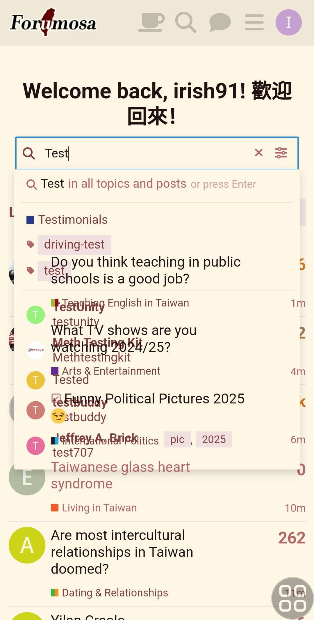
Hey, everytime I visit Formosa (on android) it shows quite a large header that takes up alot of mobile screen real estate and a search function that is not really useable as the background is transparent.
How do i remove both? For the search just using the search icon on the nav bar is fine.
“Welcome back…” I think is fine if you have haven’t visited for a few weeks/months, but every single time you visit the site, even within minutes is abit much (it’s just in my opinion).
Even just make the margin-top and the font much much smaller.
Bad idea. I’m pretty sure that’s determined by the wrapping and dependent on the screen/window width and text size.
So having a hard line break would just make the thing even more annoying for any configurations where it currently fits on a single line (like my desktop). If it has to be there, I’d prefer it to take up less space, not more…